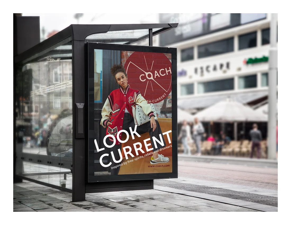
Coach Branding
I was tasked with the goal of rebranding a company from start to finish. Beginning with the research stage, each student had to pick an existing company to be rebranded and come up with a work schedule, a hypothetical cost sheet, and study the competition surrounding your company including their logos, mission statements, and brand applications. I chose the legendary American Leather company COACH. Coach as a company has a long rich history. It started in 1941 and was America’s first leather company. Coach started out as just a leather handbag company but over the years has grown to create a wide variety of products including recently creating a ready-to-wear collection.
Brand Applications
To View my Process Books Click below
Research, Logo Development, Brand Applications, Brand Usage Guide
Competitive Analysis
In order to rebrand COACH effectively, I needed to see how it compared to its competitors in a number of key factors. I believed that COACH’s closest competitors were Michael Kors, Tory Burch, Kate Spade, and Dooney & Bourke. I created a series of charts where I could compare COACH against its competitors. Through my initial research, I discovered four unique aspects of COACH’s business that would be good to compare competitors against creativity of designs, engagement of customer base, quality of service, and target market. COACH places itself above its competitors by having many different product options and being a very engaging brand.
Mission Statement
COACH, one of America’s original lifestyle companies embodies an American attitude with its rich heritage of finely crafted goods. The soul of American individuality, by embracing its rich history of pairing exceptional materials with innovative designs. Coach is a distinctive lifestyle brand for the modern it girl.
Tag Line
Logo development
With my initial drawings, I was stuck with the idea that the type would be separate from the mark. This lead me to create many different sketches where COACH’s name was placed in vibrant landscapes and scenes. I soon learned that what I designing was too complicated and that I needed to make the logo as simple as it could be. This led me to latch onto the idea of a circle as a reference to a stagecoach’s wheel. A circle could give off the idea of a wheel but I also needed slight marks to give the appearance of spokes. I didn’t really initially look that much into typefaces instead I kept a serif font that was prevalent in COACH’s current logo, rather than change the typeface completely. As I moved on I started to experiment with more modern-looking typefaces that would correspond with COACH's new positioning


